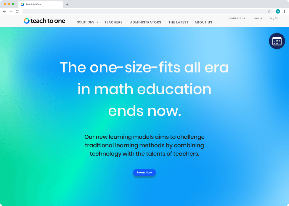
Redesign: Teach to One
Overview
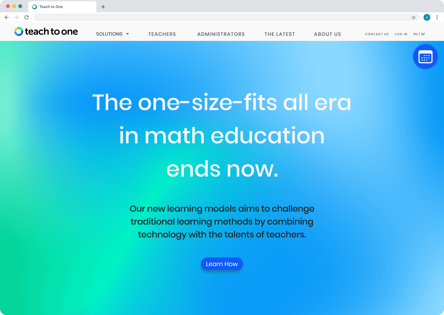
I collaborated with a team to redesign the Teach to One marketing website, focusing on improving user conversion.
My Roles
UX/UI designer
Concept artist
Walkthrough writer
Interactive prototype expert
Tools Used
Figma
SimilarWeb
Assets provided by New Classrooms Innovation Partners
Introduction
Teach to One, part of the non-profit New Classrooms Innovation Partners, develops web-based math tools used by educators across the U.S. for students from 4th grade to algebra. Its flagship program, Roadmaps, provides a personalized learning environment using tailored resources and adaptive content.
Over the course of three weeks, I collaborated with a team to redesign the Teach to One marketing website, aiming to improve user conversion and better showcase the available learning programs.
Background Research
Stakeholder Interview
My team began our redesign project by meeting with key members of the Teach to One team: Michelle Ward, Emily Doerr, Kelly Morgan, and Geneva Dill. They identified several areas for improvement:
Confidence: Users should feel confident in the product from their first website visit.
Product Matching: The website’s design didn’t align with the actual look and feel of Teach to One: Roadmaps.
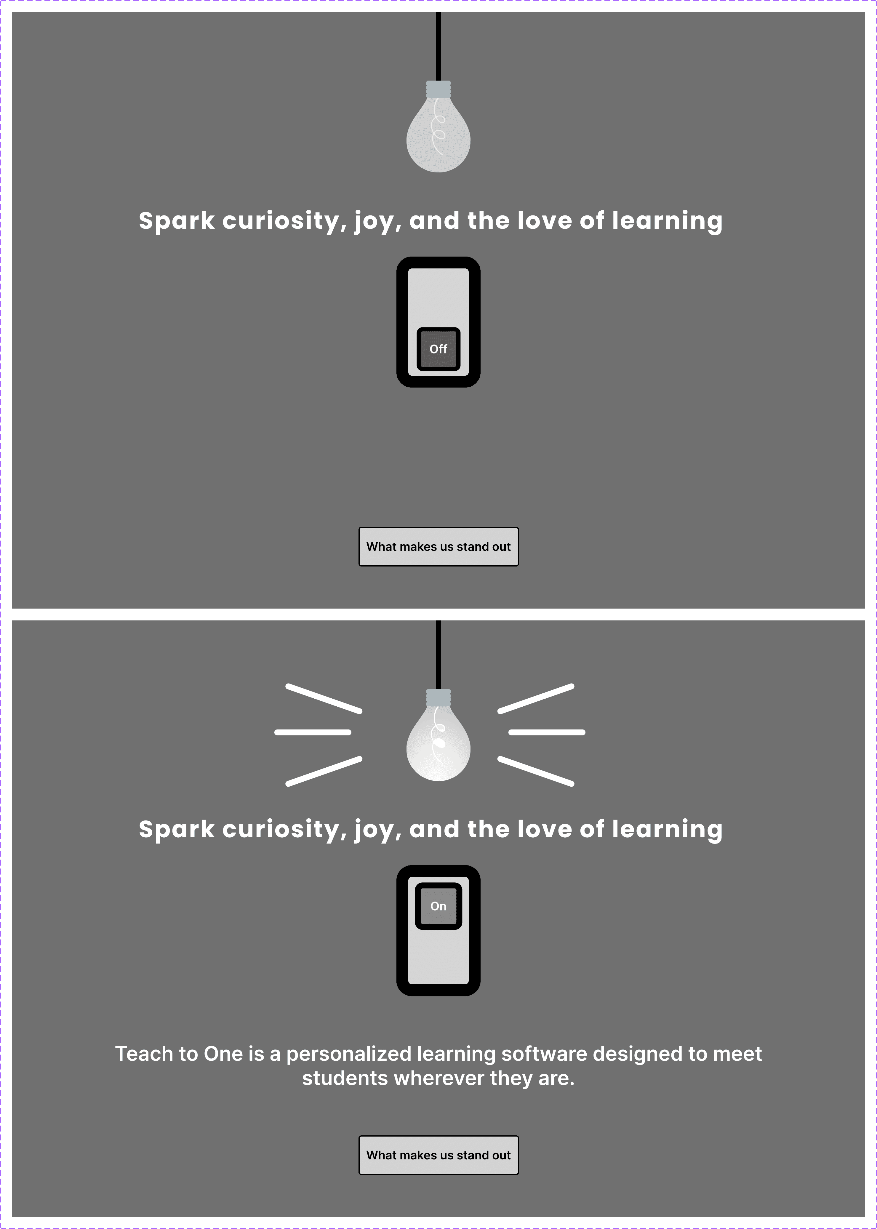
Micro-Interactions: Adding subtle micro-interactions could boost user engagement.
Navigation Bar: The navigation was outdated, featuring a discontinued product.
Non-Profit Connection: The site needed to better emphasize the relationship between Teach to One and New Classrooms, the founding non-profit.
Success for the redesign would be measured by an increase in scheduled meetings with potential users.
Website Analytics
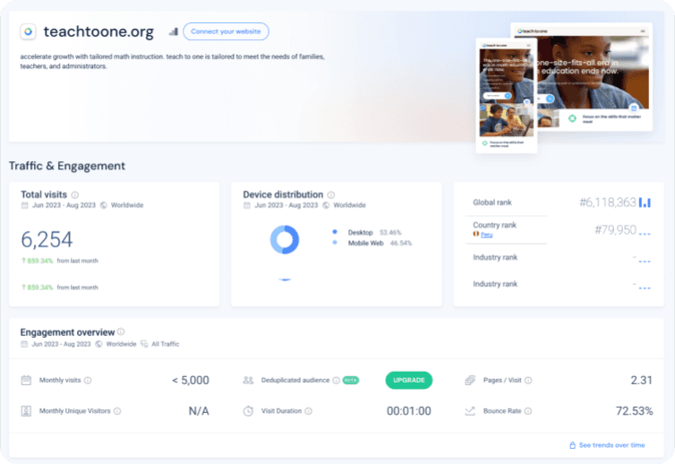
Using SimilarWeb, a Chrome extension that analyzes web traffic and performance, my team and I assessed the Teach to One homepage.
Website traffic is nearly evenly split, with 46.54% of users on mobile and 53.46% on desktop.
Users spend an average of one minute on the site.
The bounce rate, or the percentage of visitors who leave after viewing only one page, is 72.53%.
Key Takeaways
When we compared the SimilarWeb analytics with the stakeholder interviews, we identified potential areas to improve in order to increase user retention: increasing the average user visit duration and reducing user bounce.
Competitor Analysis
To get familiar with other learning software products and marketing, we conducted a competitor analysis. Below are our results.
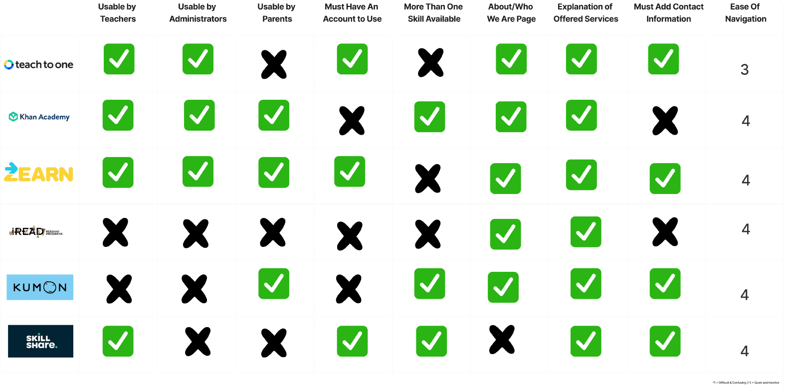
The Teach to One team identified Zearn as one of their most direct competitors during our preliminary meeting. In order to understand what might make Zearn a competititor, my team and I analyzed the Zearn website to evaluate their marketing strategies and ideate on how we might design our own site.
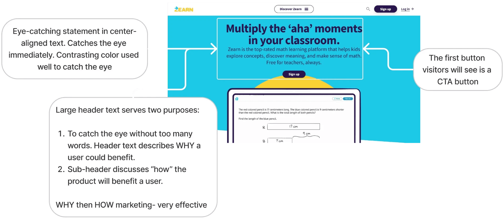
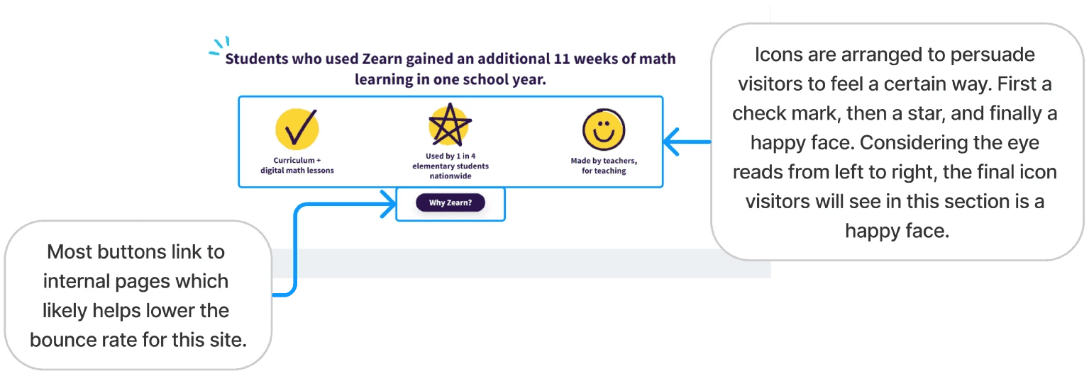
Next we looked at the heuristics of the Teach to One website, comparing the Teach to One with Zearn.
Competitor Analysis Insight
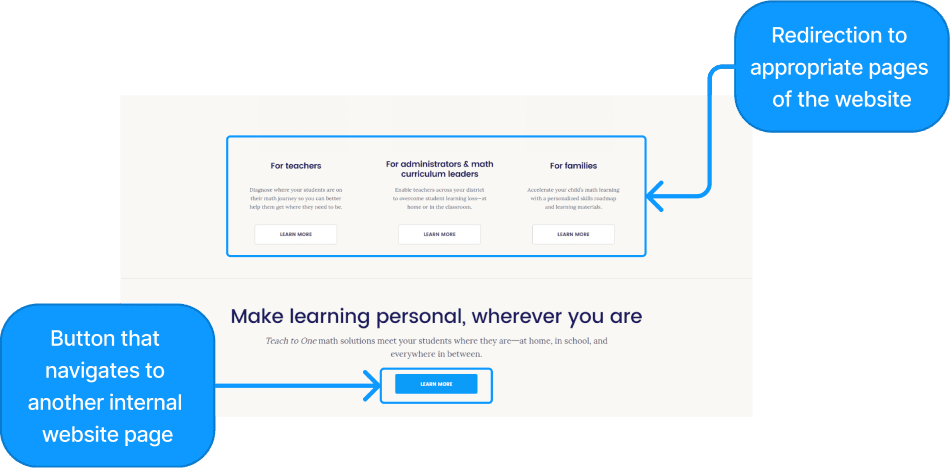
The Zearn website offered a more engaging experience, using compelling language and icons to guide users through the content. Many buttons linked to internal pages, keeping users on the site longer.
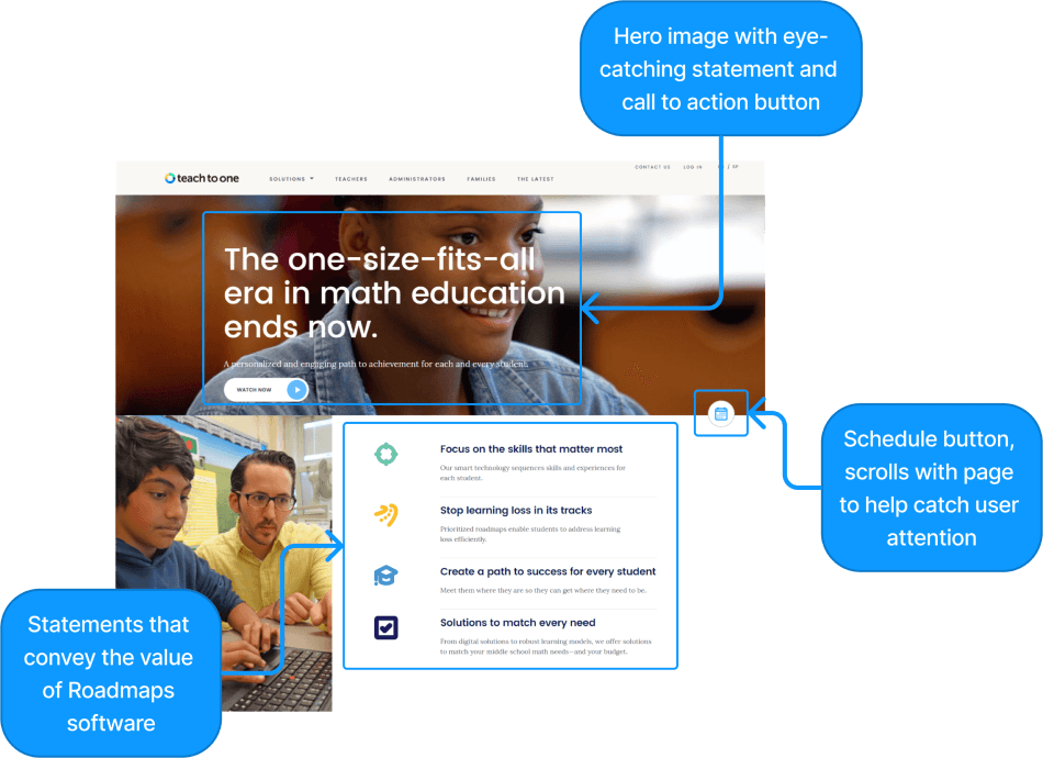
In contrast, while the Teach to One website provided more comprehensive and informative content, its organization made navigation difficult, which hindered users from easily finding relevant information.
User Research
In order to understand what might motivate the user conversion for educators and admin, my team and I conducted user interviews with potential users.
Three demographic groups we interviewed were:
Public school SPED teachers.
Charter school teachers.
Parents of children in elementary school.
Interview Insights:
Public School SPED Teachers:
Interested in algorithmic e-learning platforms for personalized student education.
Open to using e-learning platforms in classrooms.
Charter School Teachers:
Want to ensure e-learning materials are safe and effective.
Uncertain about the efficacy of e-learning platforms.
Parents of Children in Elementary School:
Concerned about the cost of e-learning platforms.
Heavily prioritize the safety of online learning environments.
User Insight Statement:
Interviews revealed that, overall, educators and parents seek confidence in supporting students' math learning. This reinforced our belief that an engaging, informative website could highlight the benefits of Roadmaps and encourage user conversion.
Design Concepts
My team and I started the ideation process by individually brainstorming ideas and then sharing our ideas during virtual meetings. At each meeting we would make a list of design choices from each individual's sketch that we wanted to investigate further.
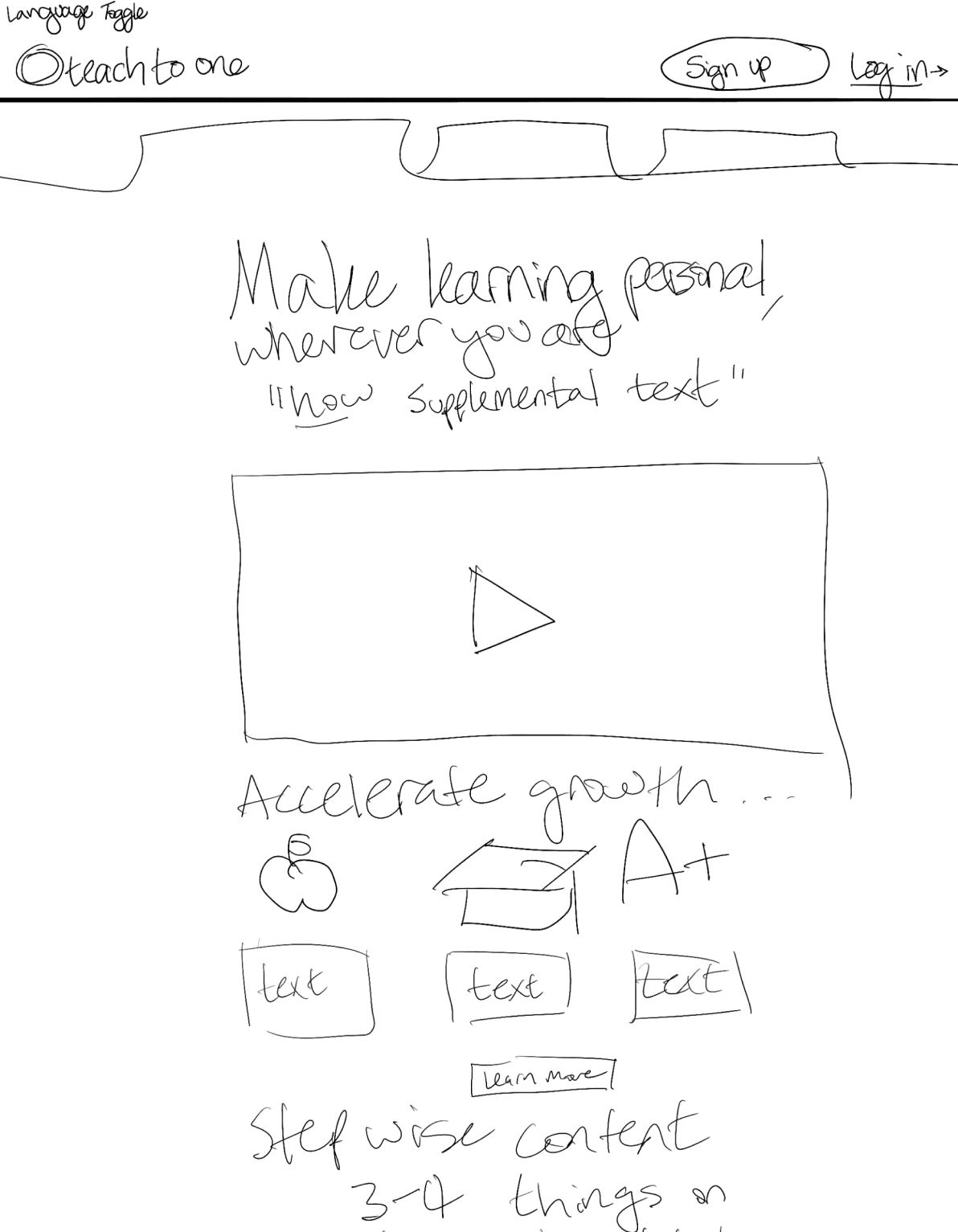
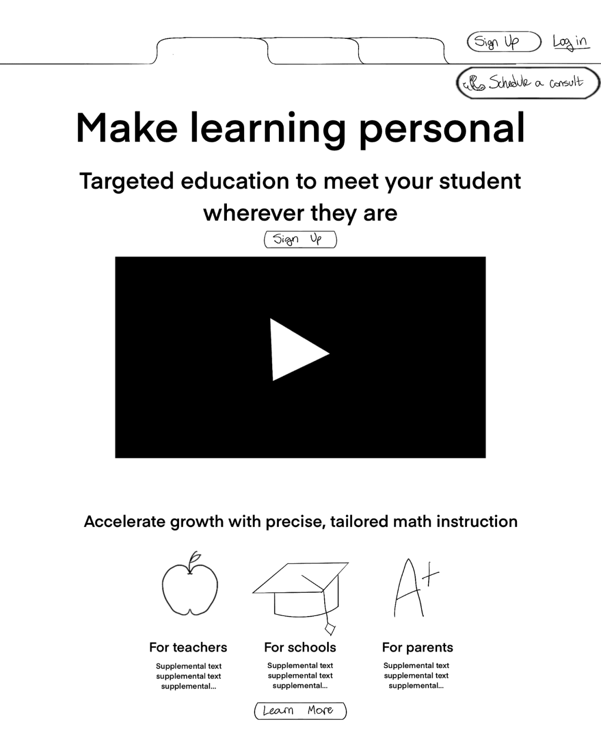
Various ideas we explored included incorporating an interactive hero image, utilizing persuasive icons inspired by Zearn, and theming the website around real-life tools that teachers commonly use, such as file folders.
Once we had some general ideas, each team member polished their designs in Figma based on feedback. We then met virtually again to continue ideating.
In our second meeting, we encountered a challenge: the designs weren’t delivering the level of engagement we had envisioned.
To address this, we returned to the drawing board, brainstorming new concepts that better aligned with the experience we wanted for the Teach to One redesign.
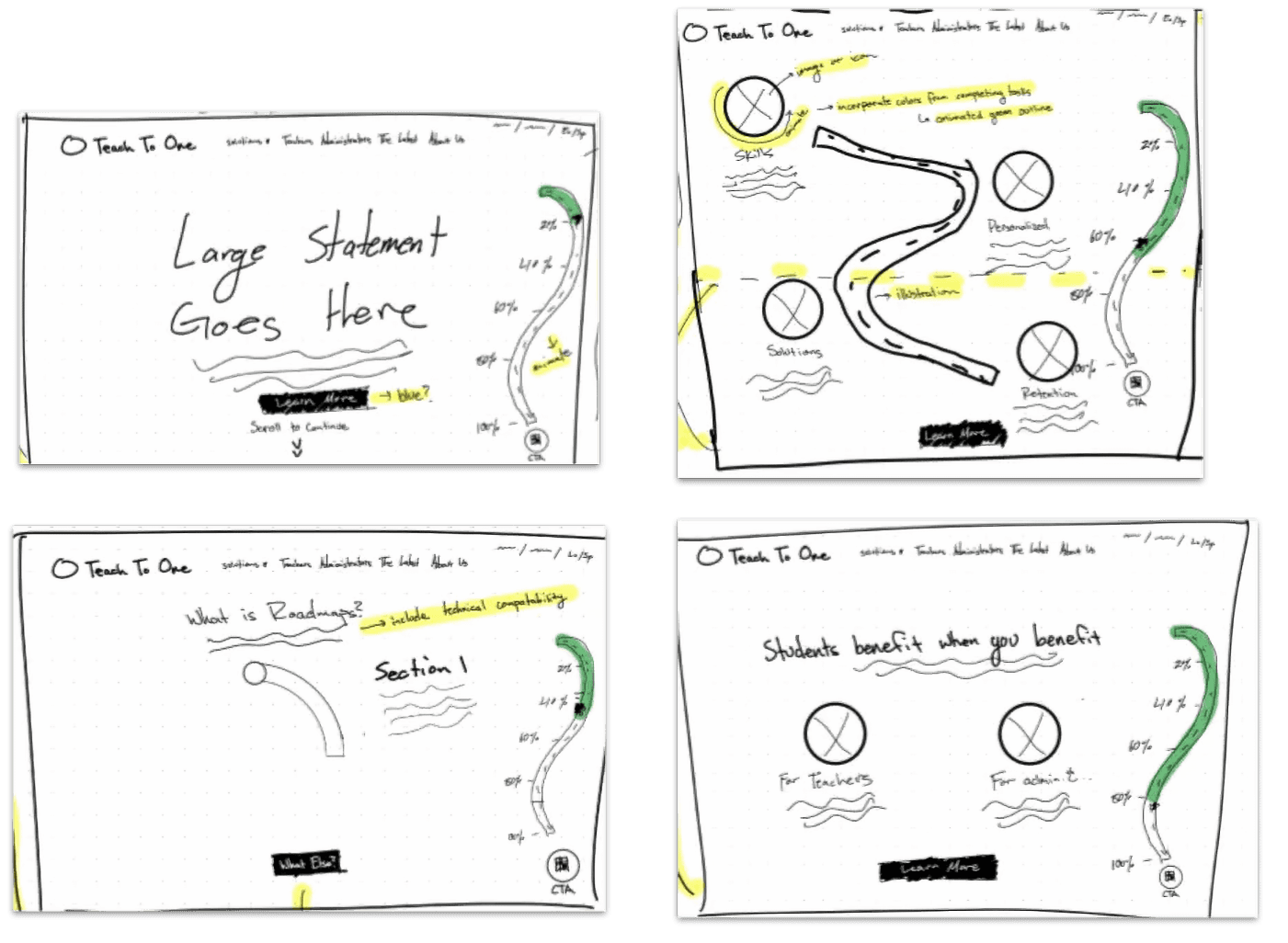
The sketches below became the basis for our final redesign.
Wireframes
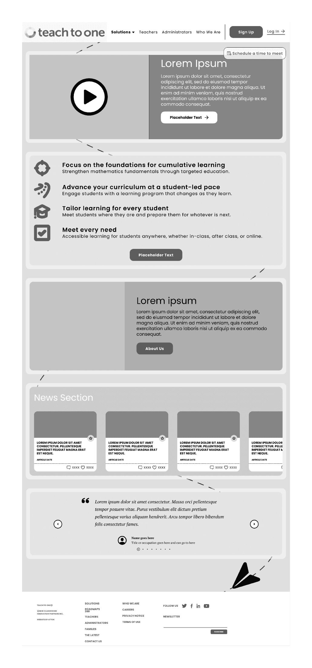
Our goal remained increasing user engagement, which we aimed to achieve by wireframing more polished versions of the product while incorporating design choices that aligned with the Teach to One Roadmaps product.
Some notable additions include:
Thematic breadcrumbs.
Eye-catching graphic elements, such as a paper plane that subtly draw user attention to the website's footer, where they can sign up for the newsletter.
Click-throughs with interactive elements that also provide quick, informational text.

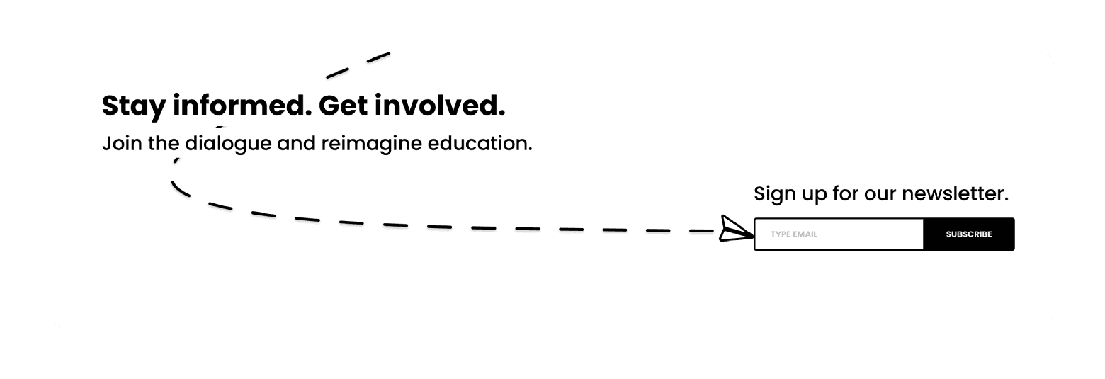
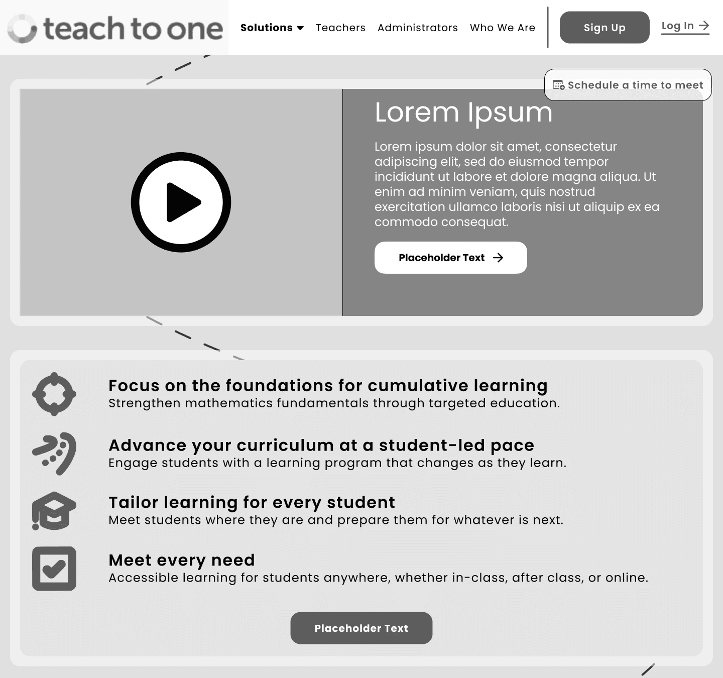
Style Guide
We collaborated with the Teach to One team to acquire essential elements such as graphics, color stories, font styles, logo guides, and more. Using these provided brand guidelines, we crafted an original style guide for our redesign.
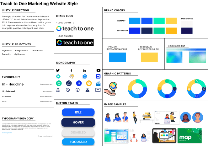
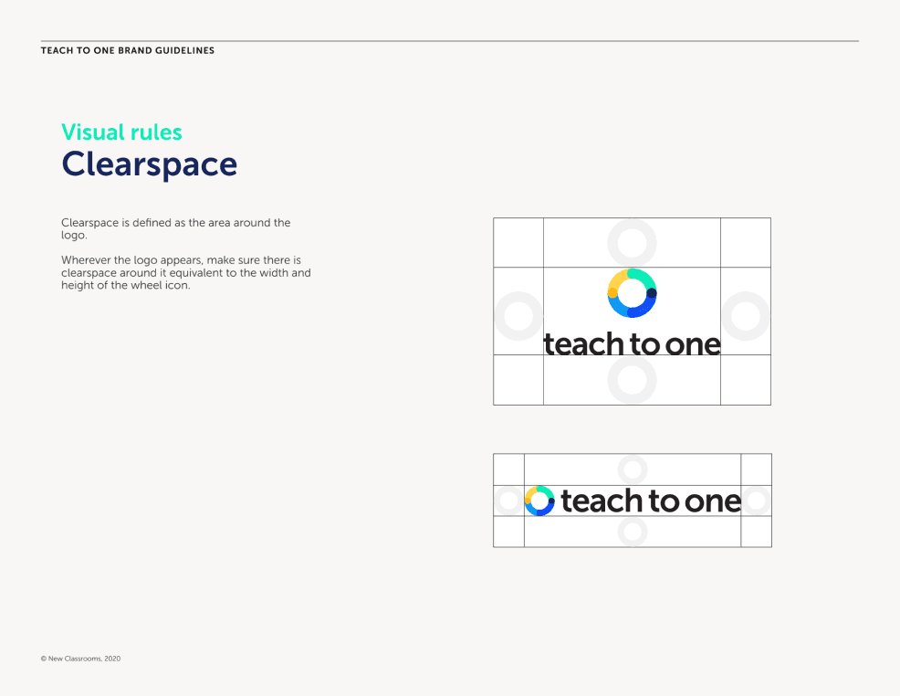
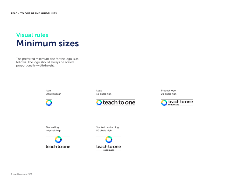
We next applied our style guide to our wireframes, resulting in a mid-to-high-fidelity design
Interactive Prototyping
After applying style, my team and I started prototyping the kinds of interactions we wanted to see in the redesign.
The biggest challenge when prototyping was creating micro-interactions on Figma, mainly due to the complexity of our envisioned interactions.
We were able to overcome this challenge by using nested animated components.
User Testing
After implementing our redesigned prototype, we began user testing the mid-fidelity prototype. To do this we tasked eight people with using the prototype.
Our user testing objective was to determine if users could easily navigate and understand the interactive features incorporated into the design.
Some feedback we recieved:
The "About Us" section is too heavy.
Button text is too small and difficult to read.
Some animations are unclear and confusing.
Responding to User Feedback
We increased the color contrast of navigation buttons and background colors because some test users had difficulty understanding how to get to navigate between pages.
We added back buttons so users could return to information from previous pages.
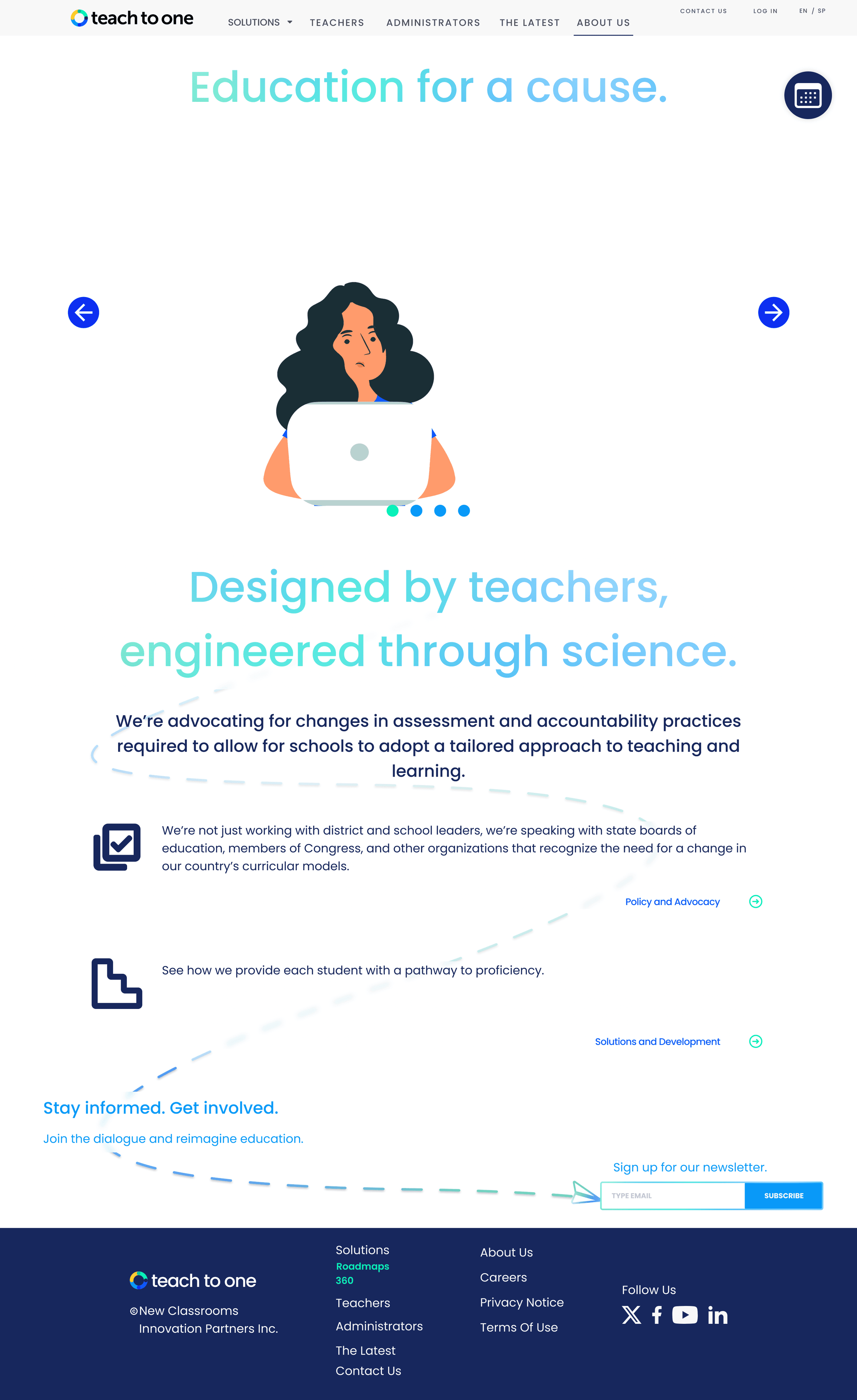
We simplified the About Us page, increased visibility of the CTA button, redesigned the bottom navigation bar, and increased the font size of primary navigation items.
Conclusion
Further Development Opportunities
Looking ahead, key next steps include additional testing, mobile and tablet optimization, expanding the design, and exploring advanced prototyping techniques. These steps aim to further enhance the usability and impact of the redesigned website.
Ending Notes
The redesigned prototype of the Teach to One marketing website offers a much more engaging user experience by utilizing user-friendly design, interactive elements, and enhancements based on user preferences.
Visual appeal, easy navigation, and clear indicators guide users through the site, encouraging visitors to stay and explore.
The incorporation of enjoyable micro-interactions and design details aligns with the Teach to One product, creating an immersive and enjoyable journey.
These improvements collectively ensure a website that connects user needs with organizational goals, delivering a more compelling and engaging user experience.
