Progress Map Redesign
Project Summary
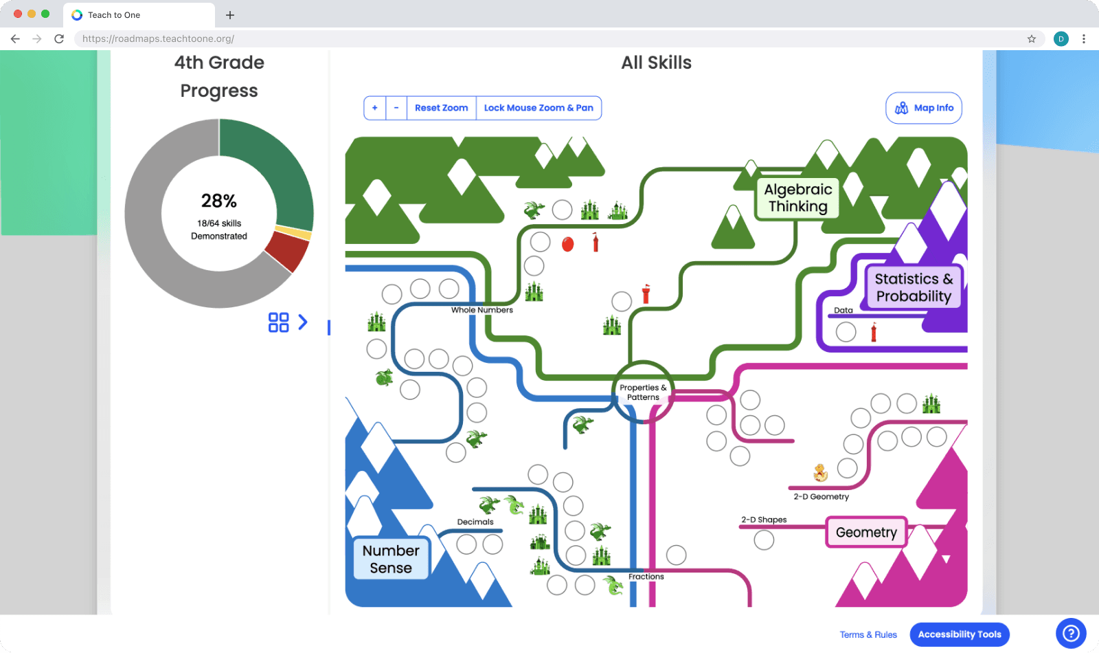
I redesigned six interactive student progress maps for Teach to One Roadmaps, creating over 100 new icons and improving layout clarity while maintaining the original skill structure. The redesign enhanced visual accessibility and navigation, aligning with the brand and making the maps easier for students and teachers to use.
Tools Used
FigJam
ProCreate
Adobe Illustrator
Introduction
The Teach to One Roadmaps student portal helps students navigate their personalized math learning journey. My task was to redesign over 100 skill icons and refresh the layout of the skill map background. The primary goal was to enhance the visual clarity and accessibility of the map while ensuring alignment with the brand’s style guidelines, which emphasize empathy and energy
The Problem
The original skill maps were cluttered, making it difficult for students to navigate between math skills. The icons also lacked clear color coding to indicate progress (e.g., passed, almost there, keep learning), and the visual style was inconsistent with the brand guidelines. This disorganization hindered students from effectively tracking their learning progress.

The Solution
I redesigned the skill icons for each school grade group and reorganized the progress map layouts to create a more accessible and cohesive visual experience. My redesigned icons not only reflect students' progress through color but also follow a thematic metaphor for growth. For example, skill icons evolve from an egg, awarded when students do not pass a skill challenge, then grow into a fully grown dragon, which is awarded when students pass a skill challenge. This, along with icon colors that coordinate with Roadmaps UI, helps provide a clear sense of progression.
Design Process
Sketching and Illustrating
I sketched initial designs with Procreate, a raster-based art app. Next, I finalized my artwork using Adobe Illustrator. This was to ensure icon artwork could be resized and interacted with while maintaining high resolution. Each icon was grouped and labeled based on its associated skill, allowing for easy toggling between skill states (e.g., “passed” vs. “almost there”) based on a student’s skill challenge result.
Layout and Organization
One of the most challenging aspects of this redesign project was the requirement to keep all skills organized in their original positions. Each skill number needed to remain along the same 'street' and within the same 'neighborhood' as in the old map. This is because the progress maps organize skills based on the skill content- moving an algebra skill to the geometry section for the sake of organization wouldn’t be appropriate due to the UI organization. I tackled this challenge by establishing spacing rules for my redesign to ensure even spacing and visual clarity.
Implementation
The icons were designed to be 60x60 pixels, small but detailed enough to be recognizable on a condensed skill map. To ensure seamless interaction between the front-end interface and the skill icons, I organized each icon by its skill result state in a clear group hierarchy within Adobe Illustrator. Each skill result was named using a systematic approach (e.g., “skill-123-0” to “skill-123-4”) to correspond with the different stages of progression. This allowed developers to easily reference the correct skill icon for display based on the student’s achievement, streamlining the integration process.
Challenges
One major challenge was ensuring the yellow skill results were legible against a white background. Although my manager was initially against adding outlines to the icons, I demonstrated that without them, yellow wouldn’t meet WCAG accessibility standards.

To address this, I added a thin, nearly invisible outline that maintained the visual integrity of the design while improving its accessibility.


Outcome
The final redesign produced a cleaner, more organized skill map that was visually consistent with the brand’s style and color guidelines. The thematic progression of the icons added an element of fun, while the improved layout made it easier for students to track which skills belonged to specific math topics (streets) and categories (neighborhoods). Although I wasn’t able to receive direct feedback from students, internal feedback indicated that the redesign was a significant improvement in both aesthetics and functionality.

Conclusion
Key Takeaways
This project taught me the importance of balancing brand consistency with accessibility. I also gained deeper insight into how small design choices, such as icon colors or outlines, can significantly impact usability for different user groups.
Next Steps
Given the opportunity to iterate, I would have loved to gather student feedback to validate the design choices and refine the icons further. I’d also explore ways to incorporate animations or interactive elements to enhance user engagement.


