Paper Ponds
Overview
Paper Ponds is an iPad game concept developed to analyze the impact of walkthroughs on user engagement and retention.
My Roles
UX/UI designer
Concept artist
Walkthrough writer
Interactive prototype expert
Tools Used
Figma
Adobe Illustrator
Adobe Photoshop
AutoCAD
Procreate
In 2022, the App Store saw an estimated 4.2 billion downloads of iOS games, with casual games dominating the market. Despite their widespread popularity, mobile games had a strikingly low retention rate, with just 3.87% of users continuing to play after 30 days.
To explore this, I worked with a team of designers over the course of three weeks to create a game concept focused on boosting user retention, focussing on fishing games due to their broad appeal in popular media. As Lewis Gordon, a video game and culture writer for The Washington Post, highlighted in a 2022 article: "There has been virtual fishing nearly as long as there have been video games … a testament to the real-world activity’s popularity as well as game developers’ enthusiasm for making a game out of even the most uneventful, everyday hobbies"
Background Research
To prepare for user research, I reviewed existing studies on mobile game UX design to understand how mobile game heuristics impact user experience and behavior.
One key resource was "The 'Rules of Play" by The Interaction Design Foundation. The article outlines two categories of gameplay rules: operational rules, which are explicit instructions given to players, and implicit rules, which are learned through gameplay.
Competitor Analysis
Gameplay
Social
Monetization
Incentives
My Takeaway - User Retention is Tied to a Sense of Investment
The implicit goal of Tap, Tap, Fish is to curate increasingly elaborate aquarium environments by investing time in gameplay, watching ads, or spending real-world money on fish and decorations. However, the complexity of the environment does not always match a user’s level of investment.
During the initial levels of the game, users are primarily rewarded with items or fish, which quickly fill the environment. Because the environment appears full, users perceive their investment as greater. This perception likely motivates users to continue playing.
Gameplay
Users can fish in various environments using different bait and gear.
Catching fish and completing tasks advance the game's progress. New fish and gear upgrades become available as users reach higher levels.
Social
Users can add friends and participate in online multiplayer fishing games.
Monetization
Users can make in-app purchases or watch ads for premium currency, exclusive gear, and boosts.
Incentives
Users can earn rewards for logging on daily. Rewards increase in value the longer a user maintains their log-in streak.
Events and challenges offer additional rewards.
My Takeaway - User Retention is Tied to a Sense of Accomplishment
The implicit goal of Fishing and Life is to catch fish by upgrading gear and exploring new environments. As users progress, new areas and equipment gradually unlock, allowing users to obtain better fish over time.
These incremental rewards reflect a user's time investment in the game, help contribute to a sense of earned progression, and encourage users to return regularly to their game.
Comparing both Games
In Tap Tap Fish, progression is tied to the user's in-game environment, which becomes more elaborate as they level up. The game offers free rewards to enhance the user’s perceived investment and encourage engagement, while also incentivizing users to watch ads or purchase premium currency. However, the abundance of free rewards may reduce the perceived value of spending money for some players.
Conversely, in Fishing and Life, progression is slower, and engagement is encouraged through gradual rewards and unlockables proportional to a user's level. Progress can be sped up by watching ads or purchasing premium currency, but users who prefer not to watch ads or spend money may find the game's frequent prompts disruptive, potentially affecting their overall enjoyment of the game.
Final Thoughts
Although Tap Tap Fish and Fishing and Life differ in style and pace, their reward and monetization structures can have a significant impact on user engagement and retention.
User Research
To understand how users select and engage with casual mobile games, my team and I developed a set of 14 questions and conducted interviews with eight individuals who play casual mobile games. The resulting data was organized using an affinity diagram and synthesized into a comprehensive user insight statement.
User Interview Goals:
Understand how users select and engage with casual games.
Understand how these user attitudes influence user retention.
Identify how the gameplay experience influences user attitudes towards a game.
Interview responses indicated that users prefer relaxing games that are easy to start and stop:
“The times I play mobile games are when I am on the bus or just waiting in a lobby and don't want intense gameplay. Something to pass the time with.”
Responses also indicated that users appreciated earning in-game rewards:
"I like getting achievements for [completing tasks] in games."
Some interviewees also provided insight about another aspect of the gameplay experience, walkthroughs:
"Walkthroughs where I can try out the steps as they come up are easier for me to understand than text-only walkthroughs."
Preliminary User Insight:
Casual mobile gamers prefer simple games that are easy to start and stop, prioritize earning in-game rewards, and are frustrated by the pressure to watch ads or make in-app purchases.
Considering Project Scope
Even though our user research showed the impact of in-game rewards and ads on user engagement, we couldn't explore this thoroughly due to our project's three-week time constraint. Instead, we focused on walkthroughs, another crucial element of gameplay identified during user interviews.
When my team and I revisited our user research, we identified another user insight:
User Insight Statement:
Casual mobile gamers value integrated walkthroughs that improve their understanding of gameplay mechanics without disrupting immersion.
Prototype
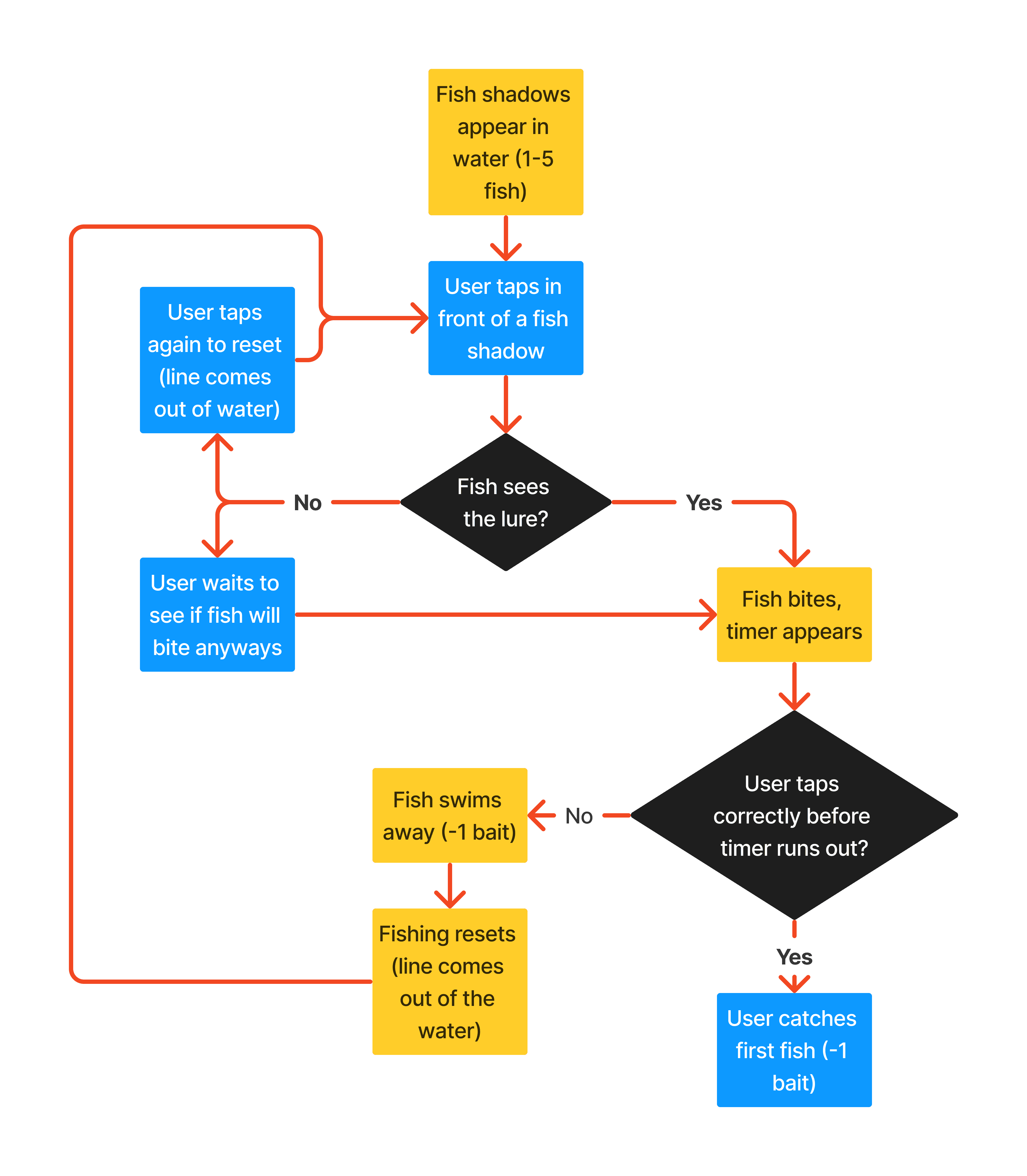
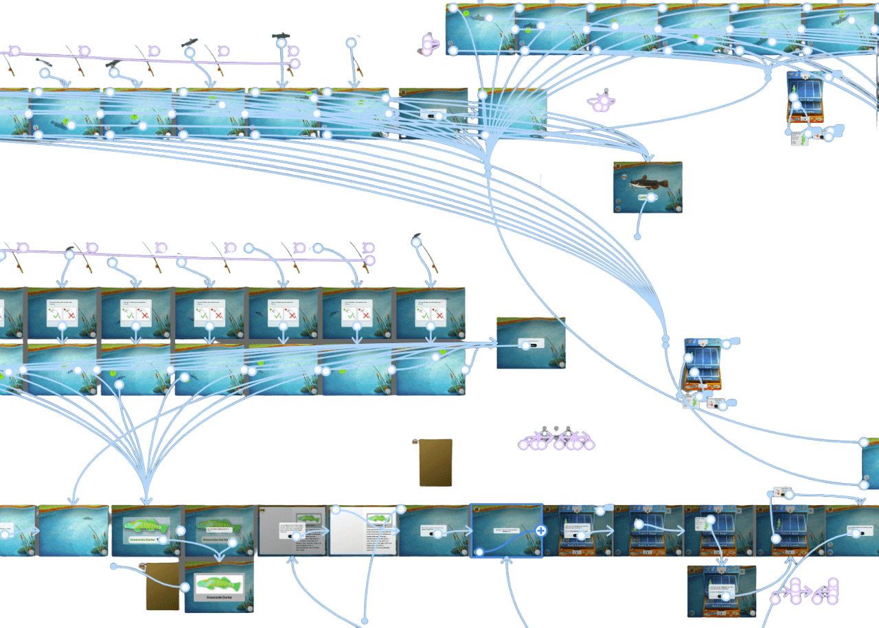
My team and I created a user flow diagram to organize the steps of our walkthrough.
While the final product differs slightly, revisiting and refining the user flow in the initial prototyping steps was more efficient than revising our prototype.
Low-Mid Fidelity Prototype
Sketches
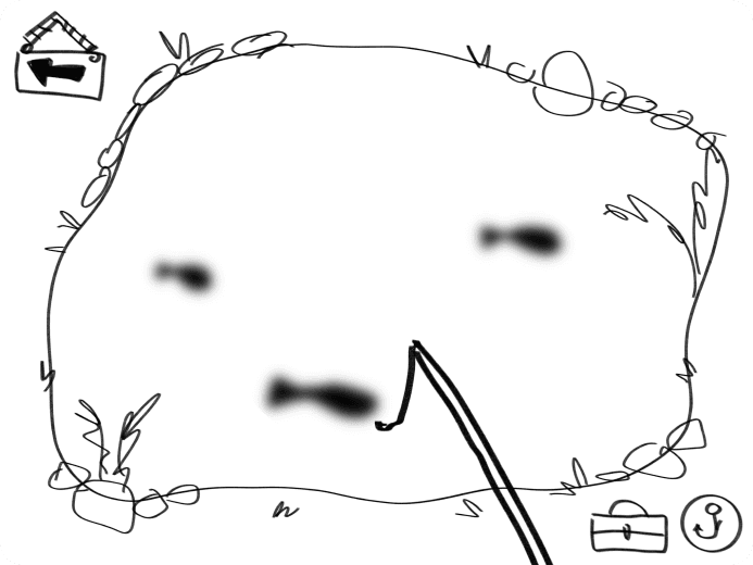
We began our design process with a 30-minute quick sketch session. Each member of the team sketched out four to six potential gameplay screens. We then met to discuss our sketches, keeping note of our best ideas.
Wireframes
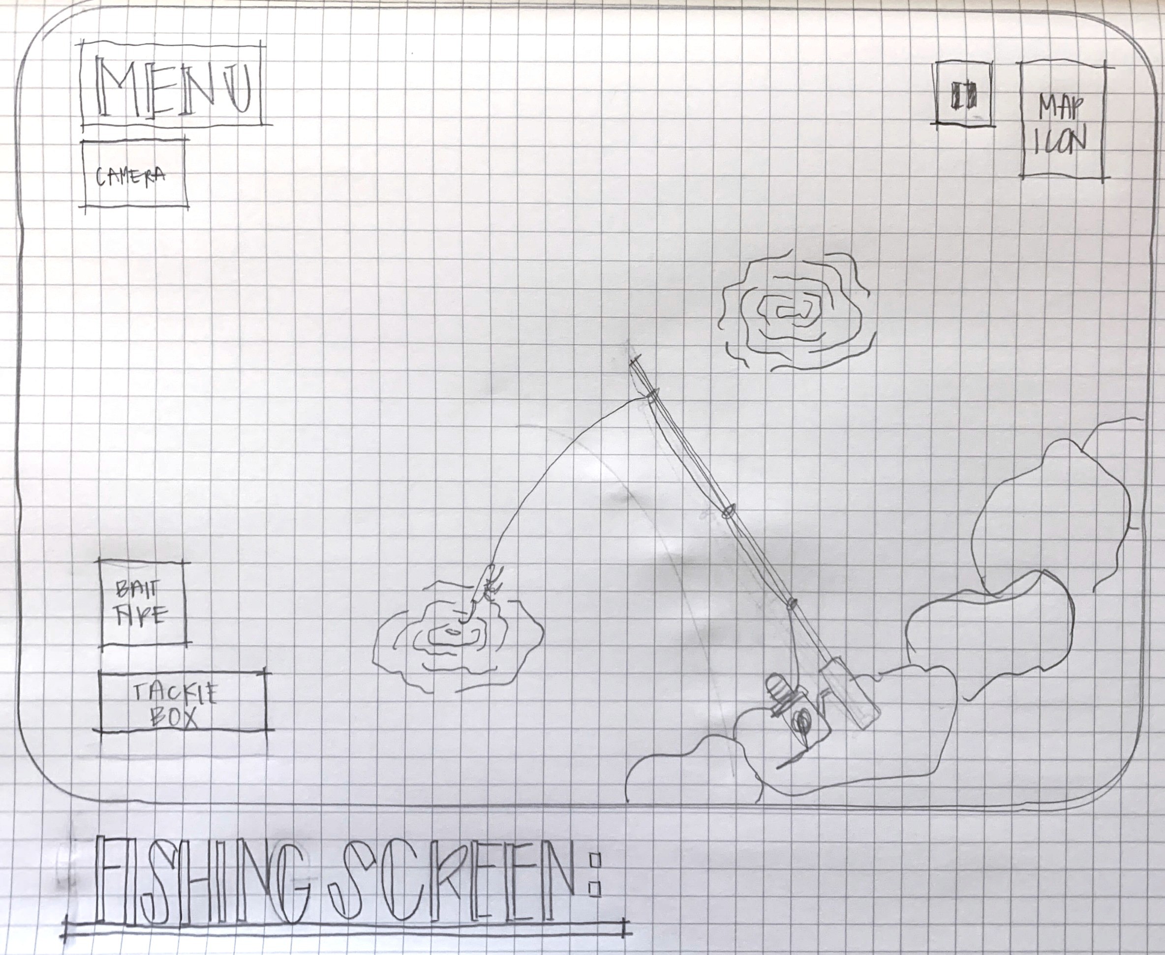
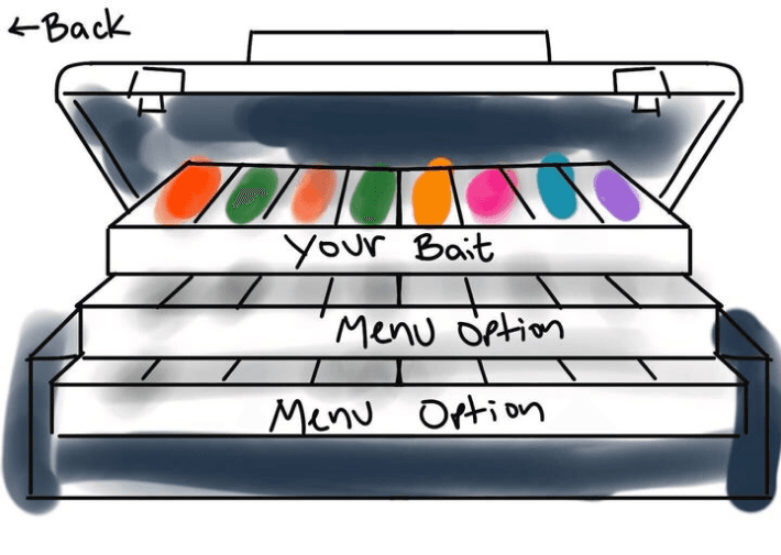
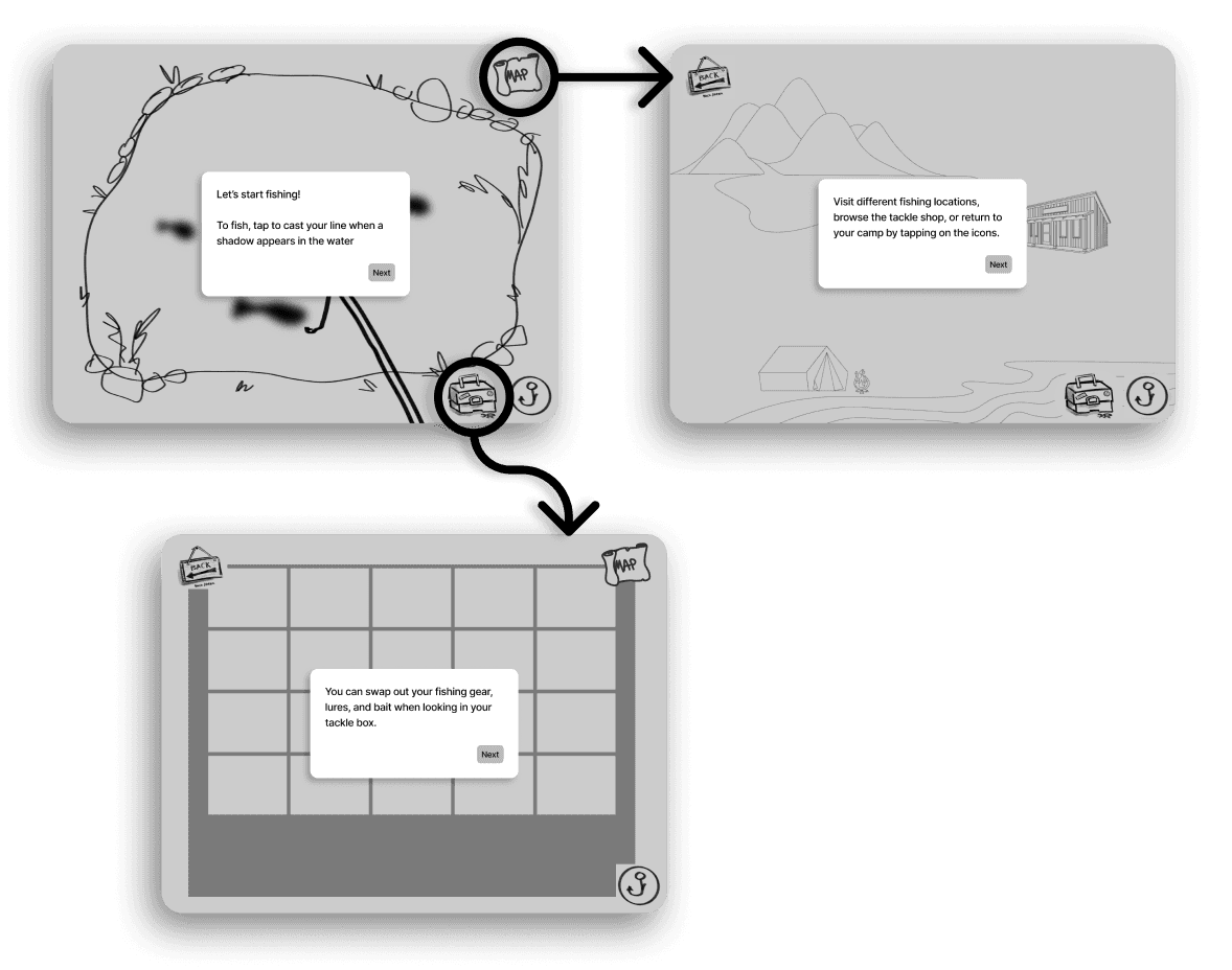
Once we had a rough idea of how our concept might look, we created wireframes of three main locations in the game: the fishing location, inventory, and world map.
We also began to create a walkthrough script, taking into account the walkthrough length and amount of text on each step.
High-Fidelity Prototype
Style Guide
My team explored potential styles for our game by first organizing a collection of images from other games. We were particularly inspired by the styles below:
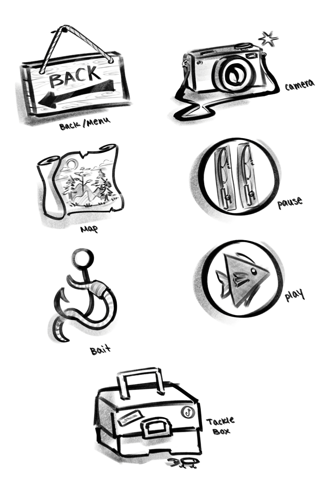
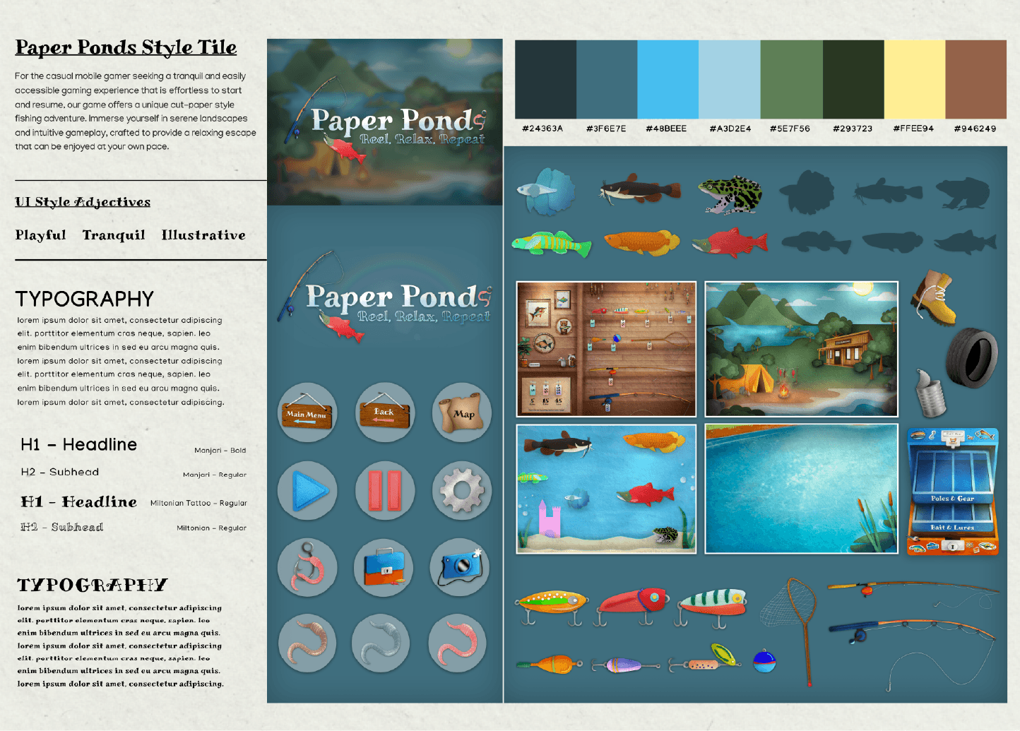
Once we had an idea of how to proceed, we considered colors, typography, icons, buttons, and more.
To ensure a comprehensive style, we organized our definitive style choices into the style guide below.
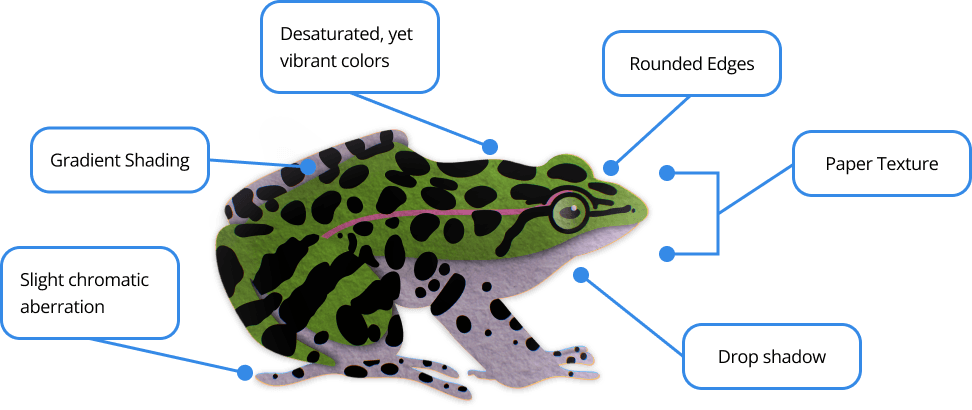
To streamline our design process, my team and I established clear style guidelines for object assets, animations, and area backgrounds:
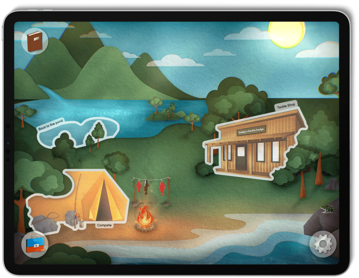
We opted for a desaturated color palette to mimic craft paper, limited object colors, and applied gradient shading, drop shadows, chromatic aberration, and paper texturing. This involved layering two different paper textures over colored illustrations.
Objects were crafted with rounded yet sharply contrasting edges.
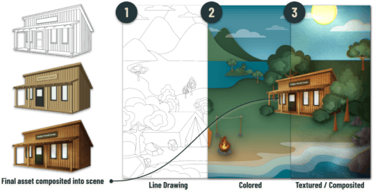
Asset creation followed a three-stage process: Sarah, one of my team members, handled the initial line drawings, I expanded on the line drawings and applied base colors and shadows, and finally, Olivia, another team member, executed the final rendering, adding shadows, texture, and visual effects, such as chromatic aberration, for lighting and depth.
Interactive Prototyping
Developing the playable fishing game prototype became a personal passion project, requiring around 40 hours of my own time. Although Figma is traditionally used as a design tool, I pushed its limits to bring our team’s vision to life.
Our animation style focused on smooth, lifelike movements. For instance, fish animations varied between 1000ms and 1800ms per frame to achieve different movement speeds, while menu overlays eased into view at 500ms for a fluid transition.
One challenge I faced was designing clickable fish animations. To work around this in Figma, I created an animated component.
I began by making a frame the same size as the prototype, setting the background to transparent, and positioning both the fishing rod and a fish shadow asset. Keeping the fishing rod consistent across frames, I created a component made of ten separate frames. When active, users could see the fish shadow moving along a predetermined path.
This was only one of the many workarounds I deployed during my prototyping process.
User Testing
The primary objectives of our user test were to gather comprehensive and general feedback on our walkthrough. We aimed to assess the ease of user navigation—identifying areas of potential confusion and ensuring a user-friendly experience.
Our goal was to determine whether users understood how to use tools and icons to navigate between various screens, play the game, and access in-game information.
How does the pacing of the walkthrough feel to users?
Can users navigate between locations in the game?
Do users know how to access and use in-game tools?
From our testing, we discovered several key insights:
First and foremost, users really enjoyed the game concept and wanted to be able to play the game.
Secondly, the walkthrough was perceived as text-heavy. To address this, a potential solution was to introduce gameplay concepts at a more gradual pace.
Additionally, users expressed a desire for a motivating element or challenge within the game, as this was unclear when users played the prototype.
While we achieved a lot, there were still areas we wanted to improve with more time. We aimed to add more fishable areas on the map, include a greater variety of fish, maintain consistent colors and typography, introduce more complex game mechanics, and further develop the tackle shop. Additionally, we considered the possibility of coding the game if time allowed.
In this three-week UX/UI design project, my team and I explored the mobile gaming experience with a focus on user engagement as a strategy to improve retention.
During the process, my team explored ways to implement walkthroughs in ways that guide gameplay without disrupting immersion—an aspect highly valued by casual gamers. Additionally, by creating original assets for the project, we were able to integrate a unique visual style while ensuring style consistency across the entire project.
In conclusion, our fishing game prototype strikes a balance between creativity and user-centric design, demonstrating how thoughtful UI elements can elevate the user experience and, in turn, improve long-term retention.
